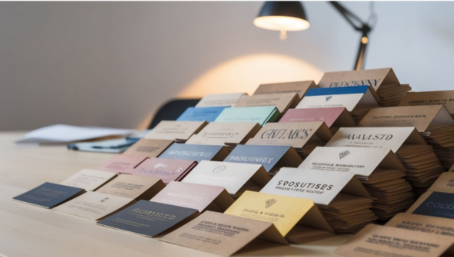
Selecting the right font and design for a name tag is necessary for clear communication and brand representation. Remember, a polished name tag improves brand awareness and guarantees exposure in business environments. Businesses utilising plastic card printing services in Singapore must then pick typefaces and designs that complement their brand and industry norms.
Best Fonts for Name Tags and Name Cards
The font used on a name tag or card affects readability and professionalism. Here are some of the best options:
1. Sans-Serif Fonts
Sans-serif fonts are widely used in professional name tags and cards due to their clean and modern appearance. Examples include:
- Helvetica – A timeless choice, easy to read, and commonly used in corporate environments.
- Arial – Similar to Helvetica but slightly more rounded, offering excellent clarity.
- Futura – A geometric font that conveys a sleek and contemporary look.
These fonts work well for companies investing in plastic card printing services as they ensure high legibility, even on small cards.
2. Serif Fonts
Serif fonts add a touch of formality and are often used in law, finance, and education. Examples include:
- Times New Roman – A traditional font that conveys professionalism and reliability.
- Garamond – A classic yet stylish option that remains highly legible.
- Georgia – Designed for screen readability but also works well on printed materials.
While serif fonts are generally used for printed documents, they can also be effective for high-end business cards.
3. Modern and Unique Fonts
Modern and unique fonts can enhance brand identity for businesses wanting to stand out. Examples include:
- Montserrat – A bold, contemporary font ideal for startups and tech companies.
- Raleway – A stylish yet professional font that offers a unique look.
- Lato – A versatile option suitable for both creative and corporate sectors.
Ensure the unique font you choose for your name tag remains readable and aligns with the company’s image.
Key Design Elements for Name Tags and Name Cards
Font choice is only one aspect of a professional name tag or card. The overall design must also be considered to ensure maximum impact.
1. Colour Scheme
The colour scheme should reflect the brand while maintaining readability. High contrast between text and background enhances visibility. Common choices include:
- Black text on a white or light background for a professional look.
- White text on dark colours for modern appeal.
- Brand colours for consistency in marketing materials.
Avoid overly bright or neon colours that reduce readability, especially on small cards.
2. Layout and Spacing
A well-structured layout ensures information is easy to read and aesthetically pleasing. Best practices include:
- Hierarchy of information – Name should be the most prominent, followed by job title and contact details.
- Adequate spacing – Avoid clutter by using sufficient white space.
- Alignment – Left or centre alignment works best for readability.
A well-balanced layout enhances the effectiveness of plastic card printing services, ensuring professional results.
3. Material and Finish
The choice of material affects the durability and perception of name tags and cards. Popular options include:
- Matte finish – Reduces glare and provides a sophisticated appearance.
- Glossy finish – Enhances colours but may cause reflections.
- Embossing or Foil Stamping – Adds a premium touch for executive-level name cards.
Businesses using name card printing services should ensure their provider uses high-quality materials to guarantee long-lasting impressions and durability.
Common Mistakes to Avoid
Even with the right fonts and designs, certain mistakes can reduce the effectiveness of a name tag or card. Common pitfalls include:
- Overly decorative fonts – Difficult to read and appear unprofessional.
- Small font sizes – Reduces readability, especially in dimly lit environments.
- Too much information – Clutters the design and distracts from key details.
- Low-quality printing – Poor printing can diminish professionalism and brand impact.
Businesses employing printing services must ensure high-resolution prints to maintain brand credibility.
Conclusion
Selecting the best font and design for professional name tags and cards is essential for visibility and branding. Modern typefaces offer distinctiveness, serif fonts add formality, and sans-serif fonts provide clarity. A carefully considered colour palette, design, and content also improve the finished product. Businesses investing in plastic card printing services in Singapore must prioritise these factors to guarantee expert and efficient name tags and cards.
Contact Paclin Office Products for visually appealing name cards that leave a lasting impression.

